Portfolio Information
- Date: August 2018
- Skills: UI, UX, IA, Research
- Client: BLOOMS
PROJECT OVERVIEW
Looking for a new challenge to take on, I worked with an up and coming flower delivery service to create a mobile app. They wanted to be mobile-first rather than web-based due to stats that we’re all on our phones so much! The app has multiple paths but the two main ones we needed to consider were for that of the consumer and for that of the florist.
THE CLIENT
BLOOMS is an app-based startup that allows anyone have flowers, bouquets, and other floral arrangements delivered to anyone within an hour. Currently, they’re planning to start operating in NYC, SF, and Atlanta, with hopes to expand throughout the first year in business. From the start, they want it to be an account based app – but they also want people to be able to browse their awesome bouquets without having to sign up yet. Users must be able to choose their delivery location, select a delivery time, and select a bouquet from a variety of products. BLOOMS partners with local florists, who are able to “claim” a new order whenever it comes in – similar to Lyft. The florist who claims it, prepares the order and delivers it to the recipient on the specified date (or in 1 Hour – which is BLOOMS niche).
THE PROBLEM
BLOOMS operates in a highly competitive industry, with the likes of 1800Flowers, Bouqs, Farmgirl Flowers, and UrbanStems aggressively working to win over flower-buyers and lock in exclusive partnerships with florists.
They hope that their position as a mobile-first startup will allow them to differentiate themselves, since many of their competitors focus on the desktop experience. By creating a beautiful in-app experience similar to that of services like Lyft and Soothe, they hope to scale quickly and expand into new cities. They believe the biggest room for growth comes from focusing on these areas of the app experience:
THE CUSTOMER APP EXPERIENCE:
It is important that users 1) can create an account in just a few clicks, 2) select their delivery location and time easily, 3) search in a variety of ways, and 4) check out quickly and safely and with confidence that their order will be delivered to the right place at the right time.
THE FLORIST APP EXPERIENCE:
It is important that florists 1) can create an account with the understanding that they will have to be verified as a legitimate business, 2) select their location and the amount of business they can fulfill, 3) co-brand their bouquets so they get some exposure, and 4) can notify customers of the status of their order easily. It needs to (obviously) be as intuitive as possible, as florists are more focused on creating beautiful bouquets than keeping watch over an app.
PROJECT CONSTRAINTS
- Users must be able to sign up quickly via Google or Facebook authorization
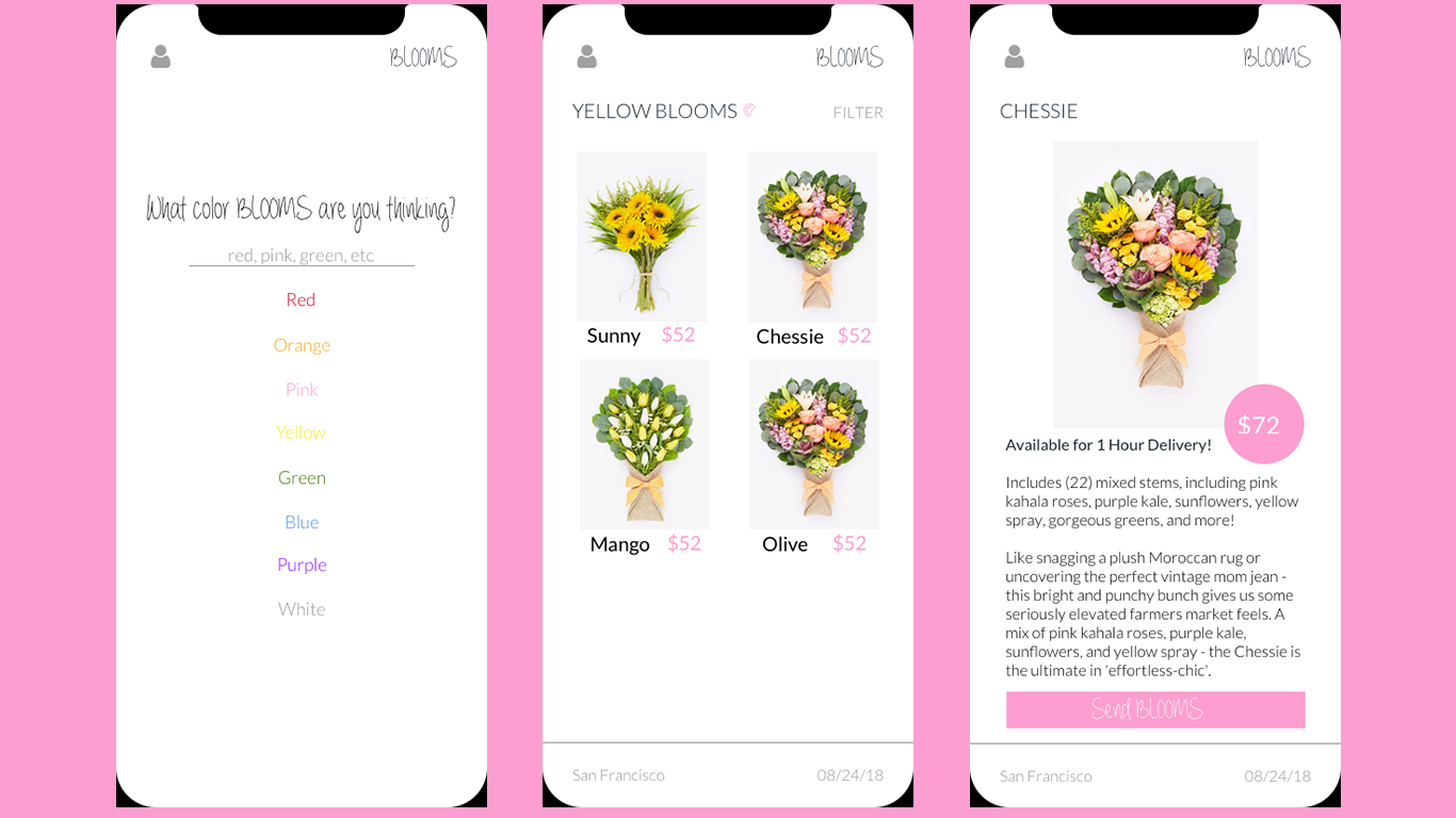
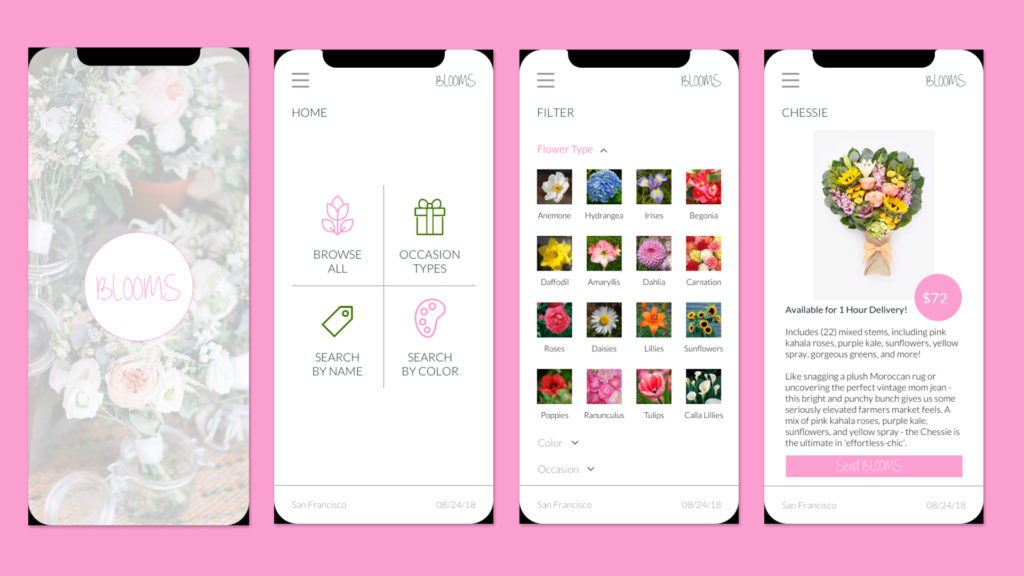
- Users must be able to search and filter products by price, occasion, flower type, and color
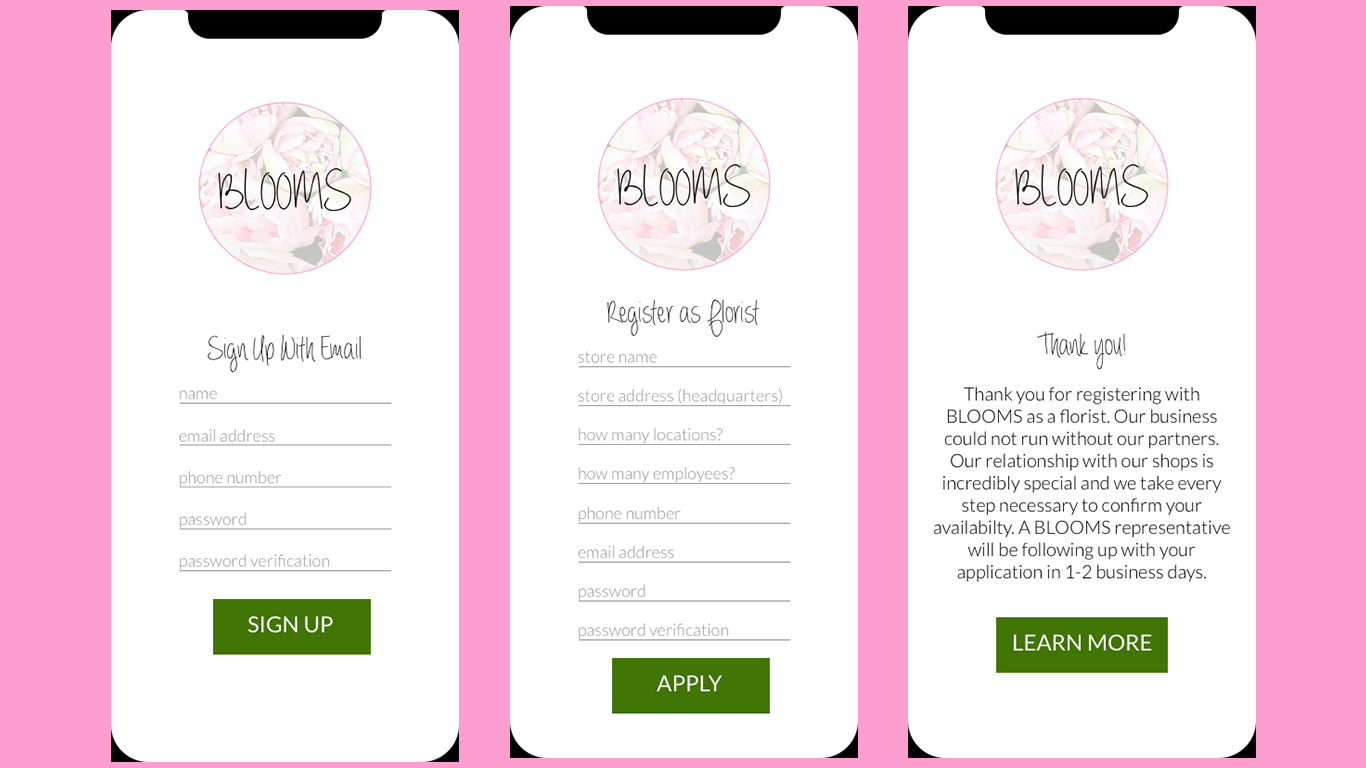
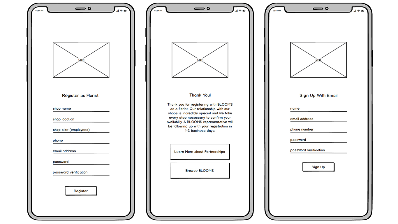
- Florists must be able to sign up for their account within 2 screens and then receive information via a 3rd screen about the approval process (a salesperson from BLOOMS will call them within 48 hours to review their application)
- The client would like you to incorporate some form of “order status” tracker for users to see where their order is in the delivery process (Received, Preparation, Delivery, Delivered). There should be a corresponding design for the florists where they update this status tracker as well.
THE SOLUTION
The mobile-first BLOOMS app allows consumers and florists to work together. Customers are able to filter products by occasion and by flower type, color, and price.
Users can search through a variety of bouquets, which note if they’re available for 1-hour delivery that day. They’re able to easily change date of delivery and location of delivery. Once they decide they like a particular bouquet, they have the option of adding a vase or note. After they’ve placed their order, the app will keep them update on a real-time Order Tracker that the florist updates when they’ve finished a particular task (prepped, shipped, delivered).
Florist have a different experience that includes easy sign-up, their product list/inventory, the dates they can work, the volume they can work, and more. They receive a notification when a new order comes in and they’re able to claim it or pass. The Florists are responsible for keeping the consumers up dated with the Order Tracker.
TOOLS USED
Pen + Paper (Sketching/idea generation), Balsamiq (low-fidelity wireframes), Sketch (high-fidelity wireframes, prototype).
Florist View
Customer View
RESEARCH AND DISCOVERY
INITIAL RESEARCH
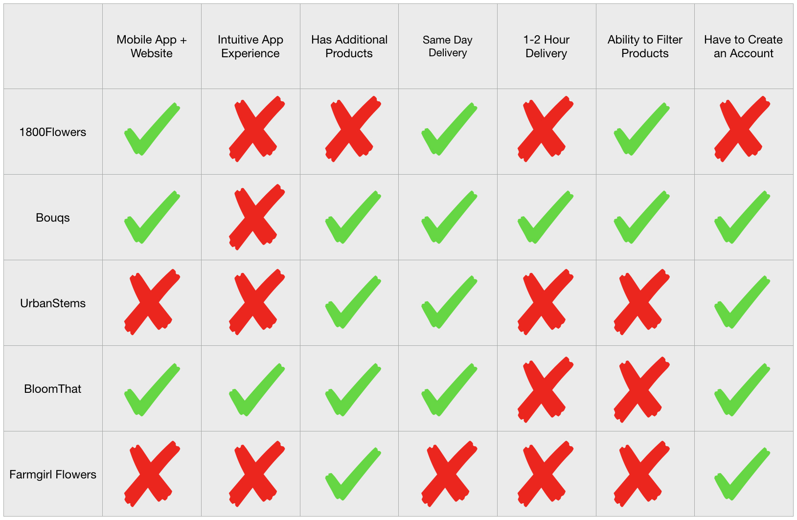
In order to familiarize myself with flower delivery services that are competitors to BLOOMS, I researched 1-800-Flowers, Bouqs, UrbanStems, Farmgirl Flowers, and BloomThat. This research consisted of browsing their websites and downloading/using their apps (if they had one). I made notes about what I liked, didn’t like, things I noticed that seemed important to include, things I noticed that I wouldn’t have noticed if I weren’t analyzing their UX, and how each made themselves “unique” despite the fact that the service is all in the same space.
In order to understand what will be the florists experience, I studied apps that are in the “app-based services” market – Uber, Lyft, UberEats, Soothe, etc. This helped me gather a list of best practices and assisted in my understanding of what a business goes through when working through 3rd party vendors.
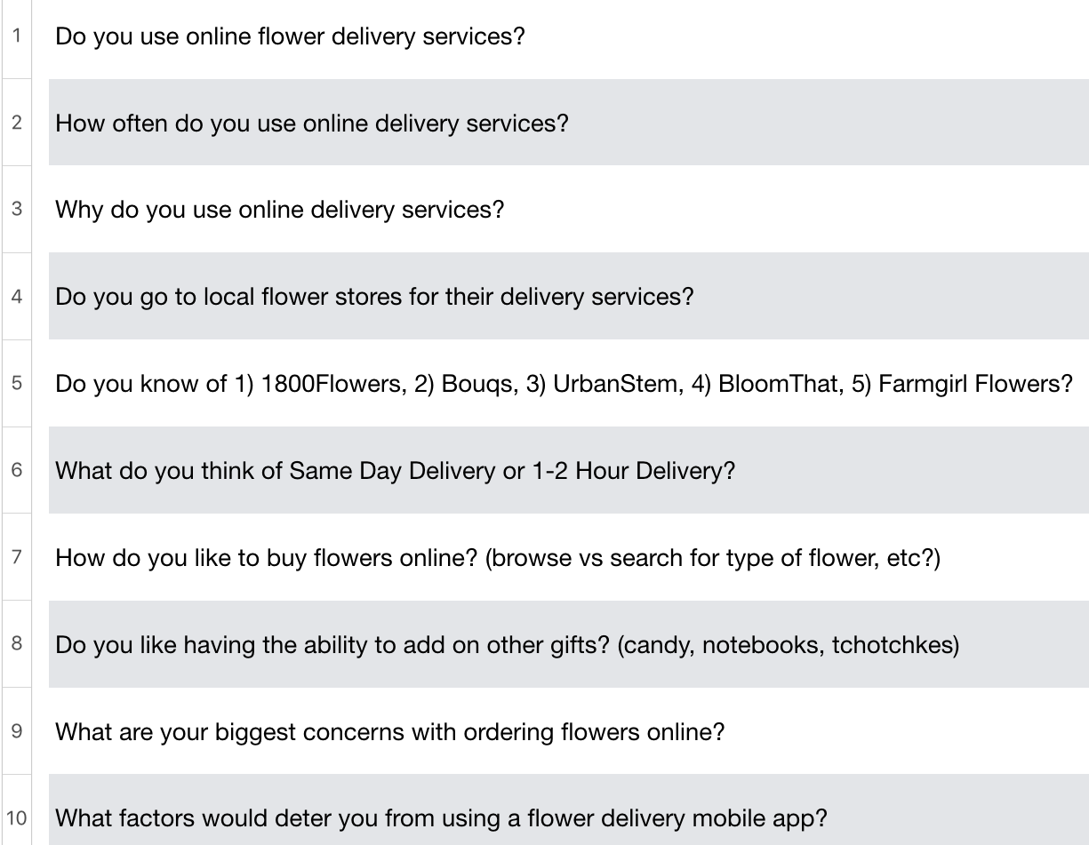
CONDUCTING INTERVIEWS
Next, I needed to learn more about users and potential users. I conducted 10 one-on-one interviews with 8 people who have used a flower delivery service before and 2 who had not.
FINDINGS
- Flower delivery services were typically used when customers wanted to send flowers to someone living in another state/region or for convenience (“I forgot”).
- Flowers are regularly purchased for birthdays, mothers day/holidays, special occasions (congrats), anniversaries, deaths. On rare occasions are they purchased for fun or just because someone wanted to do something nice.
- User prefer to use a delivery service rather than having to go to the store to buy flowers themselves.
- Users are more likely to buy from a flower delivery service that has name recognition than a local store (even if that store has a flower delivery service – because they don’t know many local stores).
- Products should appear in visual fashion but not be visually overwhelming.
- It is annoying when the price goes up for 1-hour delivery/quick delivery.
- Important things to note that help make customers decisions in liking a product: price is a major factor, the more images the better, bouquets need to look how they look online in real life, products need to be delivered on time, the more transparency with shipping the better.
INSIGHTS (based on findings)
- Show order status and updates; customers like to be kept up to date with shipping and shipping notifications.
- Purchases will increase near and on holidays such as mothers day and valentines day. Florists must be prepared for high-demand during these times.
- Include shipping charges in total cost.
- Make sure flowers are delivered ON TIME and continually update customer on order status
- Show the customer what they want because typically they do not know; make it easy to filter color and occasion. Some customers will know the name of the flower, others will not. Some customers may want to browse – make this visual and easy.
- Don’t overwhelm customers with too many “if you like this bouquet, you may like this bouquet.”
- Don’t overwhelm customers with too many options. No add ons except for vase or no vase.
IDEATION PROCESS
USER PERSONAS
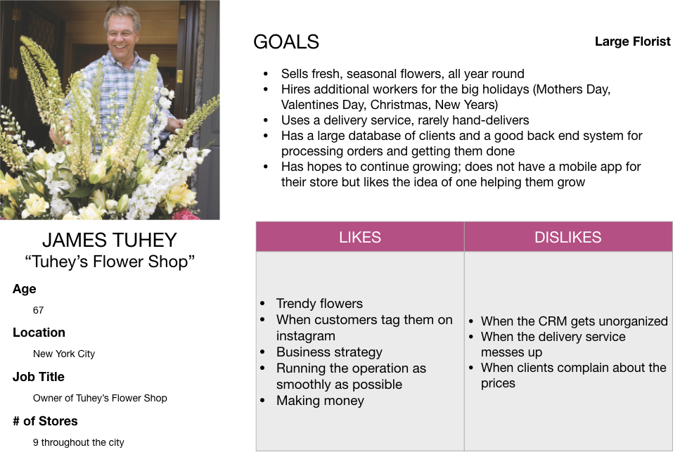
In order to address the needs of potential users, I created five user personas based on data collected. Three of the personas represent customers and the other two represent florists. The customer personas show three people who could be interested in using a mobile flower delivery app. I’ve tried to include enough variety in age, location, personality type, and career.
For the florists, these two represent those who wish to become part of this service. I created a persona for large floral businesses and smaller florist shops.


USER FLOW
Trying to keep the customer and florist goals in mind, I created a user flow for each type of user. These user flows are based on what I learned in the research phase.
SKETCHES
After I determined a solid user flow, I started sketching out ideas for the app layout. My sketches are a bit more geared towards and older phone as the screen size looks smaller, but I planned to adjust the size of items per screen size.
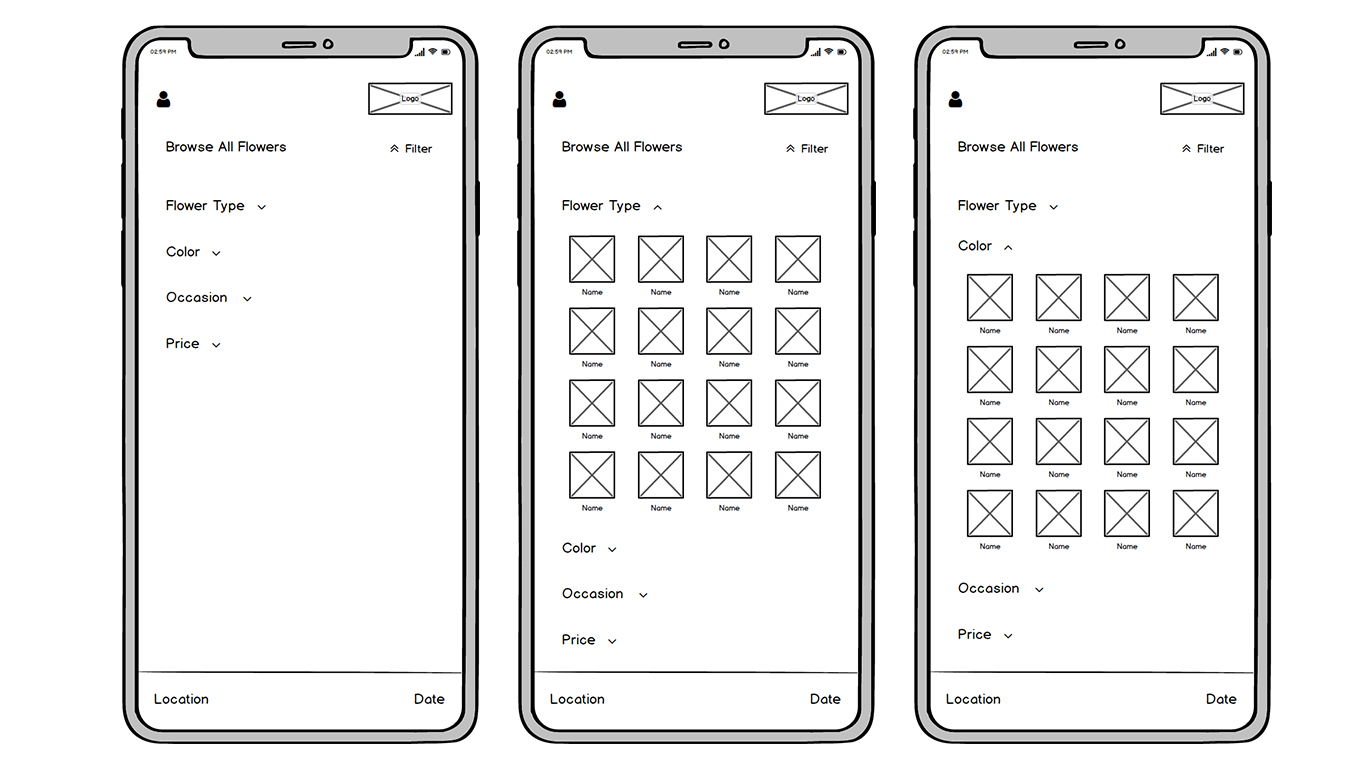
WIREFRAMES + PROTOTYPE
Using Balsamiq, I began creating low-fidelity wireframes for each screen to have a better idea of where I would place certain elements. This began to give me a clearer idea of how everything would look in final product with colors, images, and branding.
I used Balsamiq to conduct a few usability tests through its prototyping capability. It was necessary for me to see what users initial thoughts were regarding the layout and flow.


USABILITY TESTING
Testing the prototype was where things got really fun. I worked with 10 testers who walked through the app 2 times – the first time being a customer, the second time being a florist. They attempted to do particular tasks as each, and also just poked around. For both the tasks and the casual use, I had them verbalize what they were doing and why they thought it was the best action to take.
Once they passed the splash screen, I asked them to complete the following tasks:
AS A CUSTOMER:
- Sign up with email, select your location and the delivery date
- Browse all, filter by occasion, and select birthday
- Order The Chessie and pay with Apple Pay
- Change location, then decide against it.
- Go to your account and view your last order.
FLORIST TASKS:
- Sign up as florist and learn more about partnering with BLOOMS.
- View your inventory and tell me how you would update the bouquets you can stock for the day.
- View your orders and track the status of your most urgent delivery.
After making changes to my prototype from the first round of usability testing, I conducted a second round of testing to see how users would respond to the new changes. Customer and Florists tasks remained the same as Round 1 testing. Overall, I noticed significant improvements compared to the first round of usability testing and it seemed like users were able to to move from screen to screen with more ease as they completed the tasks.
Changes I made were switching the icon in the top left corner from a menu to an avatar to indicate this is where the account information would be held, adding additional indicators like back buttons and forward buttons (grey x and pink arrow), and help screens for the florists.
FINAL DESIGN